For a lot of materials, color is just a matter of selecting from what’s available. Meaning, what’s already been produced and made for sale to wholesale resellers or end customers. But what if you’re custom producing the material? There are essentially infinite color choices, but that actually makes the process a lot more complicated.
The first thing you need is a good reference color you’re aiming for, but it’s way better if the reference is actually made from same material in order to get an accurate representation. Presumably if you’re custom making it, the material doesn’t already exist in that color… so you can really only hope to get close and then see how the actual finished product turns out.
Aside from black, the first new color of Soft Shell I introduced was a gray. It was really interesting to learn the process of defining the color… from learning about greige, to Pantone for fabrics, to lab dips. In the end, I was really pleased with how it came out and it quickly became one of our best sellers. So much so… that it started to run out and we needed to make more!
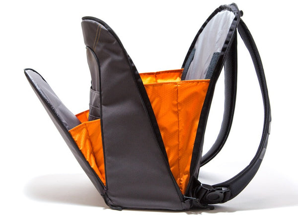
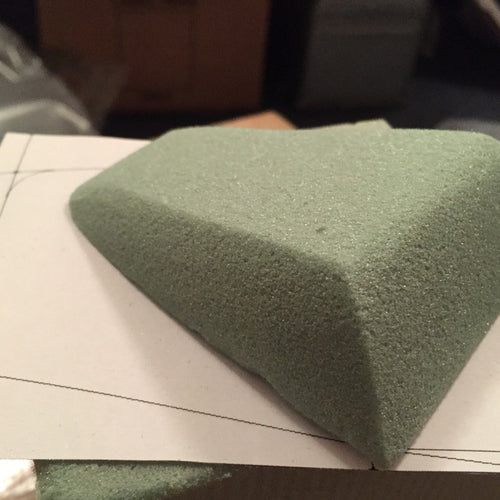
Around that time, I was developing the Slim Pack. And I thought, I wonder what a gray Soft Shell backpack would look like? We didn’t have the patterns to a point where I could make a prototype, but draping the material over a form study, I could tell the color wasn’t quite right. With a larger object like a backpack, the material just felt too bright.
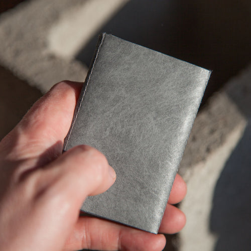
With this in mind, I happened to notice the color of a Bose earphone case I really liked. And luckily, it was made from a material that had a similar level of shininess and texture so it would make it easier to color match. When you have to produce A LOT of something like I have to do with a Soft Shell production run, it’s nice to have a bit of confidence in what the final product will look like. And I knew if it came close to this case, it would be a nice sophisticated tone for a wallet as well as be great for a backpack.
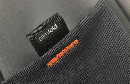
Fast forward a few months, and the Slim Pack was launched. Originally, I was only offering it in black with orange interior accents. But almost immediately, several folks requested it in “Charcoal”. Meanwhile, based on feedback from backers, I had already added a bar tack accent stitch as well as topstitch details. When the Charcoal Soft Shell arrived, I had a prototype made from it and right away I could tell it “just worked”.
While the campaign would have been simpler to run if I kept with just the black, I decided to make the Charcoal available to backers. I wanted everyone to have a bag that they loved instead of investing in something only to have a new color come out a few months later. While this probably contributed to the logistics challenges we experienced, the fact that almost half of folks selected Charcoal makes me happy with the decision.
There were die hard supporters of both Charcoal/Orange and Charcoal/Gold but of the two options, a lot more folks selected the Charcoal/Orange. Therefore, that’s the one I’m going to bring to market.
I’ve been really pleased with the response from folks who’ve received their bags as part of the campaign and I think folks will really enjoy having the option of both a backpack and wallet in the new Charcoal Soft Shell color.
Is there a color you’d like to see me make next for either a bag or wallet? Contact us directly or let me know in the comments below.



0 Comments