
I’ve had this idea on the drawing board for awhile but it took close to a year to bring it to life. When printing on Tyvek, it’s really hard to get an accurate idea of what it’s going to look like when it actually comes off the press. This is because the traditional paper printing methods for achieving the look you want can’t be used:
For color, Pantone books provide a systematic way of getting the one you want. There are books for matte paper, glossy paper, and different inks such as metallic. But colors are shifted quite a bit when printing on Tyvek.
Before going into a full production press run, a proof would usually be done on the same material using color profiles to match the color output of the actual press that will be used. But these pre-press proofing printers can’t print on Tyvek.
Screens are a method of making certain areas of a print come out lighter. They are measured in percentages and can usually be accurately represented on a computer monitor (soft-proofing) or at least on a hard proof, but how ink will behave on Tyvek is very unpredictable.
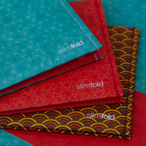
Solution: In order to get this cube pattern just right, I actually did a test proof during a previous print run I did on black Tyvek. I used a little patch on the side of the press sheet to see what a few different patters would look like, and also varied the screen amounts to get just the right balance of contrast without it appearing muddy at all.

Then during the actual production run, the metal printing plate still had to be re-made three times to fine-tune the output.
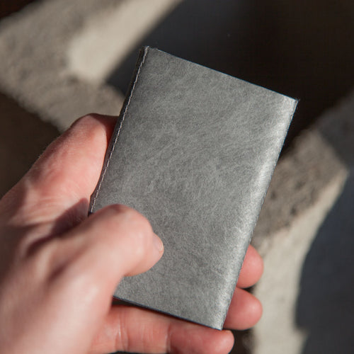
In person, they’re playful and clean yet somehow sophisticated. I’m very pleased with how they came out and am excited to finally be sharing them with you. Enjoy!
Looks great!